5 Color Trends In Your Home Decor
One of the most important questions that arise when decorating a space is what colors to choose for decor. The possibilities are many and will always depend on the environment we want to decorate, the lighting and use, our own taste, etc. Do you know the latest color trends?
In this article, we’ve listed some ideas to make you fall in love with your home again.
5 color trends in decor
Colors influence our mood and our emotions. Furthermore, they can even influence our heart rate and our ability to concentrate. For this reason, it is important that we choose the right color for the room we want to decorate.
1. Passion red
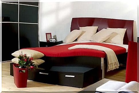
The contrast between red and white, gray and black can be a real aesthetic delight. In addition to giving the room a modern touch, it manages to awaken the senses and the admiration of guests. Red is vibrant and this energy is contagious.
In fact, due to its intensity, red stands out and activates. However, don’t overdo it, because in excess, it can cause stress.
2. Ultraviolet
According to the Pantone Color Institute , the color of the year 2018 was the ultraviolet, specifically the 18-3838 hue. This institute explains that:
So, nothing better than using this color combined with others to convey this feeling of mysticism, spirituality, concentration and creativity.
3. Oceanside
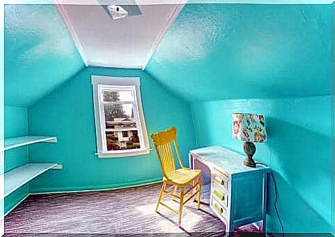
Another relaxing and serene color, ideal for environments where you sleep, read or study. It is a shade halfway between blue and green. Furthermore, as its name suggests, the color ‘ oceanside ‘ evokes the sounds and sensations of the ocean, its harmony and serenity. Provides tranquility and vitality at the same time.
On the other hand, it is an ideal color for rooms facing the sun and with a lot of external light. It will evoke much more the feeling of balance, freedom and harmony of the open ocean. Just to remind you, it was also a trend in 2018, chosen as that year’s color by the prestigious Sherwin Williams.
4. Green, the color of nature
Without exceeding its use, green is also a good choice when choosing certain decorative elements for a light colored environment. In fact, nature will always be in fashion. For this reason, it has been a trend in recent years to incorporate elements of intense green color and nature details in keeping with the style.
Intense green brings freshness and vitality, as well as balance and happiness.
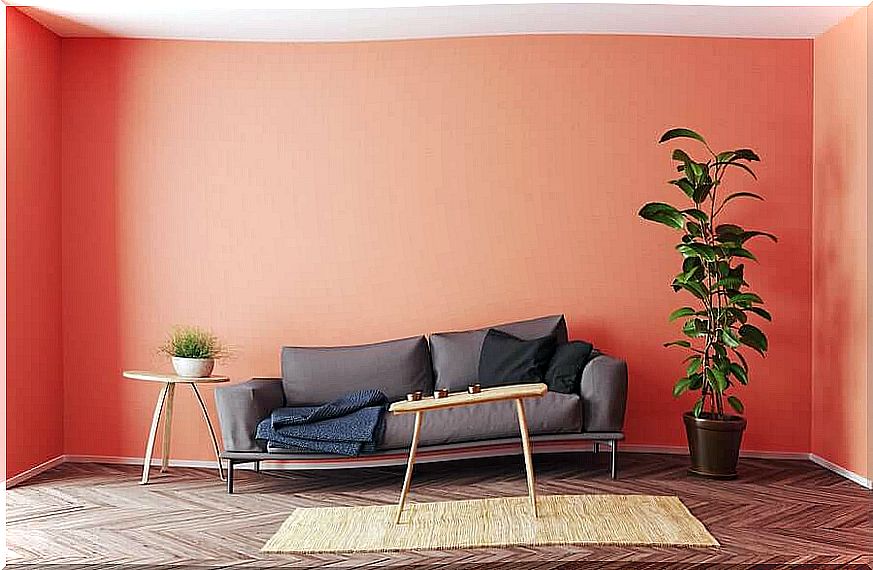
5. Living coral room: 2019 color trends
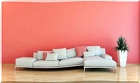
Chosen as the color of the year 2019 by Pantone, the living coral is a cheerful tone that provides vitality, full of nature and life. Furthermore, it gives a feeling of intimacy and connection, making it an ideal choice for places where we gather with our friends or partner.
According to Leatrice Eiseman, executive director of the Pantone Color Institute :
Whatever your color and the feeling you want to convey, always remember to take into account some aspects, especially the use you will make of each space:
- A bedroom should include colors that invite relaxation and sleep.
- An office must convey reflection, tranquility and creativity.
- For the living room, prefer warm colors, ideal for receiving guests, socializing and interacting.
- Kitchen decor should be stimulating and relaxing at the same time. Also, it would be a good idea to include colors like white, which evoke a feeling of cleanliness and hygiene.
What are the color trends for 2020?
For the year 2020, the same institute advises:
“ Identified by our psyche as a tranquil color, Pantone Classic Blue 19-4052 brings peace and serenity, offering a sense of protection to the human spirit .”
This trend will favor our spiritual well-being in such difficult times when health is our main concern.
So, have you decided if you’re going to apply one of these trends to your home decor?